Back to Results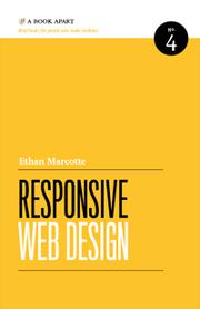
—out of 5—out of 5—out of 5—out of 5—out of 5—out of 5
Magical Tome
- First published
- 2014
- Publisher
- A Book Apart
- ISBN
- 9781952616501
Responsive Web Design
The outer archives are busy
About this book
From the publisher's [website][1]: "From mobile browsers to netbooks and tablets, users are visiting your sites from an increasing array of devices and browsers. Are your designs ready? Learn how to think beyond the desktop and craft beautiful designs that anticipate and respond to your users’ needs. Ethan Marcotte will explore CSS techniques and design principles, including fluid grids, flexible images, and media queries, demonstrating how you can deliver a quality experience to your users no matter how large (or small) their display." [1]: http://www.abookapart.com/products/responsive-web-design
Match Score
Create a free account to see Match Scores on books the community has marked — once you’ve set your preferences.
Create free accountMarks of the Realm
Marks left by readers of this tome
No community marks yet — be the first to inscribe this tome.
Pacing
Horror / Dark Elements
Romance
Spice Level
LGBTQ+ Representation
Social & Political Themes in Stories