Magical Tome
- Published
- 1999
- Pages
- 304 pages
- ISBN
- 3721203410
Max Bill
About this book
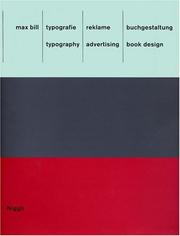
The book at hand offers a comprehensive view into an area of work from Max Bill that has so far received little attention: typography, advertising and book design. One discovers Max Bill as the tireless creator of highly individual types and commercial logos as well as a designer with a sense of visual humor – not exactly a common aspect of constructive design in this country. Bill pursued two opposing principles and accordingly left behind two lines in his work: a graphic one and a sculptural one. Taking Herbert Bayer’s universal type as a point of departure, Bill developed two lettering schemes for the Neubühl housing development and the firm “wohnbedarf”, which departed from all then-known forms. The reason for the stretched “o” in “wohnbedarf” may well have been grounded on how one perceives the text from the side; yet, behind this understanding lie formal ideas and the reductionist concept of the Bauhaus.
Match Score
Create a free account to see Match Scores on books the community has marked — once you’ve set your preferences.
Create free accountMarks of the Realm
Marks left by readers of this tome
No community marks yet — be the first to inscribe this tome.
Pacing
Horror / Dark Elements
Romance
Spice Level
LGBTQ+ Representation
Social & Political Themes in Stories